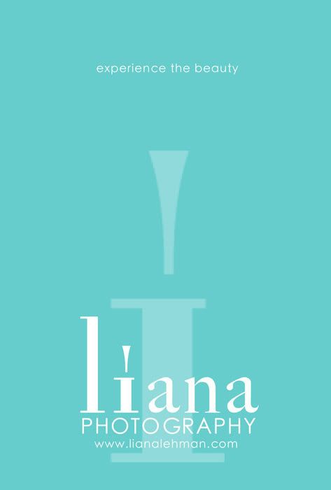
I'm not an advocate of traditional advertising but there are a FEW - VERY FEW - exceptions I make. I don't want to go too much into this controversy right here and now because it's a long discussion.... and I could talk forever on it...
... but an exception presented itself and today we were charged with designing an ad to send to the publication ASAP.
The thing is, there's a lot of clutter out there already. The "enemy" is no longer the competition - it's the clutter! So how to combat this clutter? KISS!!! The simpler, the better. It's not an easy thing to do though. Being a visual artist.... it's easy to want to clutter my ad with lots of photos and text and graphics. It's so much easier to pick a few favorite photos and slap them up there with a logo and call it an ad.
So I opted for a more daring approach - strip it bare. Simplify. Completely simplify. Advertise my photography without showing a single photo.
I dare you to apply this principal to your next ad, marketing peice, or even something less visual in nature. Think about what your goal is too! For me, it's to spark intrigue; present my business as timeless, classic, fresh; give them a glimpse of my vision; and ultimately get them to go to my web site.
In the essence of KISSing, I'll close with this:


1 comment:
Awesome Liana, simply awesome :-)
Post a Comment